

“There has long been a push for leading a more green lifestyle, but there has never been as big of a call for action to do it as there is right now.”
INTRODUCTION
There has long been a push for leading a more green lifestyle, but there has never been as big of a call for action to do it as there is right now. However, the messages that environmentalists, scientists and other sources have been spreading sometimes become lost in translation. I wanted to create a solution that allows those who have difficulty making sense of this information a helping hand, particularly due to the direct impact that the inaction of a population has on our environment. In order to formulate an effective solution I implemented five stages of design thinking methodology, which includes: empathizing, defining, ideation, prototyping and testing. These efforts came to fruition as GreenWise, an application that aims to educate users on sustainability, offer real-time solutions and connect them to local resources.
DESIGN ROLES & RESPONSIBILITIES
Throughout the process of developing GreenWise, I was solely responsible for ensuring both its completion and correctness. My responsibilities during this process included, but were not limited to:
Conducting initial user interviews
Synthesizing information to create empathy maps/personas/user journeys
Constructing wireframes
Building high-fidelity mockups
Multiple rounds of prototype testing
Two rounds of usability testing
The culmination of these procedures gave me an end result to be iterated and revised. These revisions were done on my own with the knowledge gained from the final two rounds of usability testing to deliver a final, fluid design.
GAINING INSIGHT
BETTER UNDERSTANDING THE CHALLENGES USER GROUPS FACE IN MAKING LIFESTYLE CHANGES
The primary objective of this study is to more deeply understand the challenges that users encounter while striving to lead a more sustainable lifestyle. By conducting in-depth research and gathering insights from the target audience, I was able to identify the barriers, misconceptions, and hurdles that they would encounter on their sustainability journey. Armed with this knowledge, my aim was to develop a set of user-friendly tools and resources within the application that empowers and enables users to overcome these challenges. The ultimate goal is to provide a platform that not only raises awareness about sustainability, but also equips users with solutions, fostering a positive impact on the environment and inspiring a widespread shift towards a more sustainable future.
WHO WAS GREENWISE DESIGNED FOR?
After conducting thorough research and analyzing the current trends, attitudes, and behaviors towards sustainability, it became apparent to me that both millennials and Generation Z are the ideal target audience for GreenWise. Both generations exhibit a strong passion for eco-friendly practices and social responsibility, actively seeking ways to make a positive impact on the planet. Their digital-savvy mindset aligns perfectly with the concept of an application-based solution, allowing GreenWise to engage them effectively to inspire lasting changes. Through focusing on millennials and Generation Z, I can be confident that the messages and information that GreenWise has to offer will be put to use through them.
18-42 Years old
Smartphone / Smart device owner
Active on social media on a daily basis
Relies on social media as primary source of news
Have previously participated in low-commitment sustainable habits, such as recycling
RESEARCH METHODOLOGIES
The research phase in this project incorporated various methodologies to gain a comprehensive understanding of the audience’s sustainable lifestyle habits, or lack thereof. It began with screener surveys to identify suitable interview candidates based on their lifestyle habits. Subsequently, user interviews were conducted with six participants from the Gen Z and Millennial age group, aiming to delve into their motivations for embracing sustainable practices and to uncover pain points related to receiving and understanding relevant information.
The study targeted users aged 18-42 who owned smartphones or smart devices, were active on social media platforms daily, and relied on social media as their primary source of news. Participants were also required to have previously engaged in low-commitment sustainable habits in the past, such as: recycling, using public transportation / bikes for commuting, or shopping with reusable bags.
Through selecting participants that met this criteria, I gained insights from a group of users from both demographics that show a genuine interest in sustainability. Through this combination of screener surveys, user interviews, and specific participant criteria, the research successfully provided valuable qualitative data, enabling the development of user-centric tools and resources within GreenWise to support and encourage users in their journey towards a more sustainable lifestyle.
THEMATIC ANALYSIS
IDENTIFYING USER CHALLENGES THROUGH AFFINITY MAPPING
To gain further insight from the user interviews done in the previous step, I constructed a thematic analysis of the key findings. My chosen method for the thematic analysis was to create an affinity map to uncover the underlying themes between all the interviews. This map was created by randomly placing pieces of information directly from interviews onto a board, then going through a series of grouping/aligning this information. Eventually, groups that satisfied my original research questions surfaced. The results I received were more confirming for my hypotheses than surprising, however, I did benefit from finding these two groups in particular:
“Lack of Trust
This group opened my eyes to challenges previously unforeseen– particularly, the lack of trust and/or interest in news outlets in younger participants.
“Reachability Through Ads”
While I was originally interested in the kind of ads that my participants were seeing through social media, their answers evolved into a group for the frequency of content seen, rather than the type. This gave me insight as to how reachable those who use social media are, and through what particular outlets.
EMPATHY MAPPING
In order to further build on my journey in getting to the bottom of what challenges users are experiencing with sustainability and how they feel about them, I chose to create empathy maps. These two maps embody the basic framework of the personas that lie within the audience for GreenWise: The Beginner and The Expert. Having outlined the actions, thoughts, feelings, pains, gains, and inputs of each of these personas allowed me to be more informed for the next step in creating user flows.
IDENTIFYING AND BETTER UNDERSTANDING USER GROUPS


CREATING USER FLOWS
OPTIMIZING PATHWAYS FOR DELIVERING SUSTAINABILITY-BASED LEARNING TOOLS TO USERS
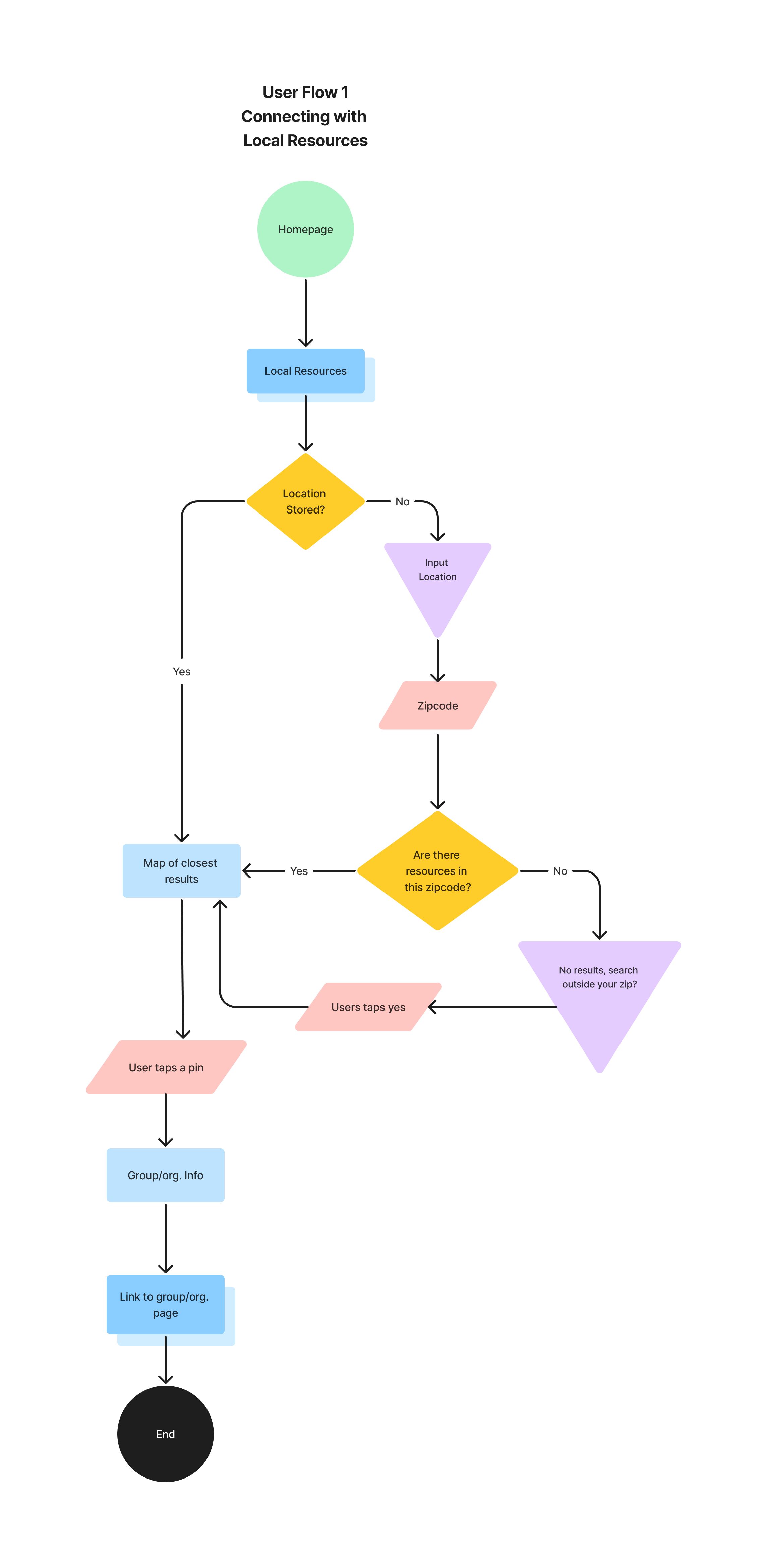
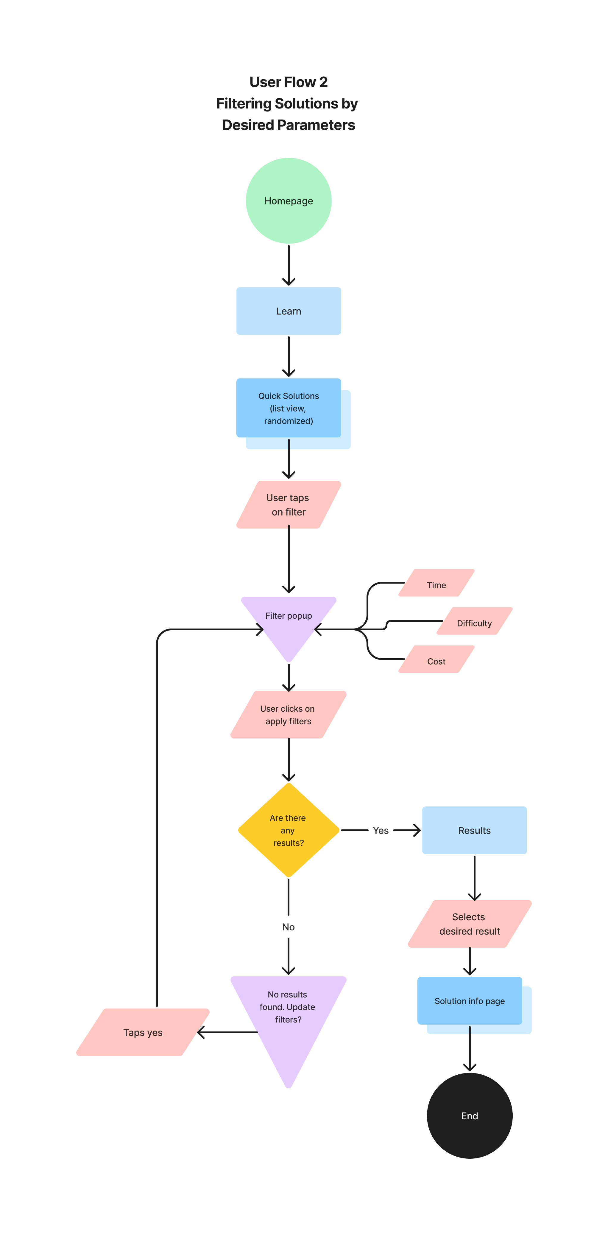
Creating user flows for optimizing learning about sustainability was essential to provide users with a structured and logical pathway to explore this new information and resources. A well-constructed user flow ensures that users can easily access educational content, track their progress, and navigate through different topics, enabling a more engaging and effective learning experience on sustainability-related topics. Additionally, user flows help to identify potential bottlenecks or areas where users might disengage, allowing for continuous improvement of the learning platform; ultimately, fostering a more informed and environmentally conscious user base.
Below are views of my chosen user flows:
Connecting with Local Resources
Filtering Solutions by Desired Parameters
Learning Progression

WIREFRAMING
From my chosen user flows, I started by sketching out a series of screens for potential wireframe concepts. These initial sketches were put through a round of guerrilla usability testing to ensure that my rough outline for the navigation / use of GreenWise was as intuitive as possible for users. After my revision from the guerrilla testing, I moved on to rendering my sketches into low-fidelity screens. These renders included the basic structure originally found in my first sketches, with the slight alterations provided from the user feedback in the testing. Below, two out of three user flow wireframes can be seen.
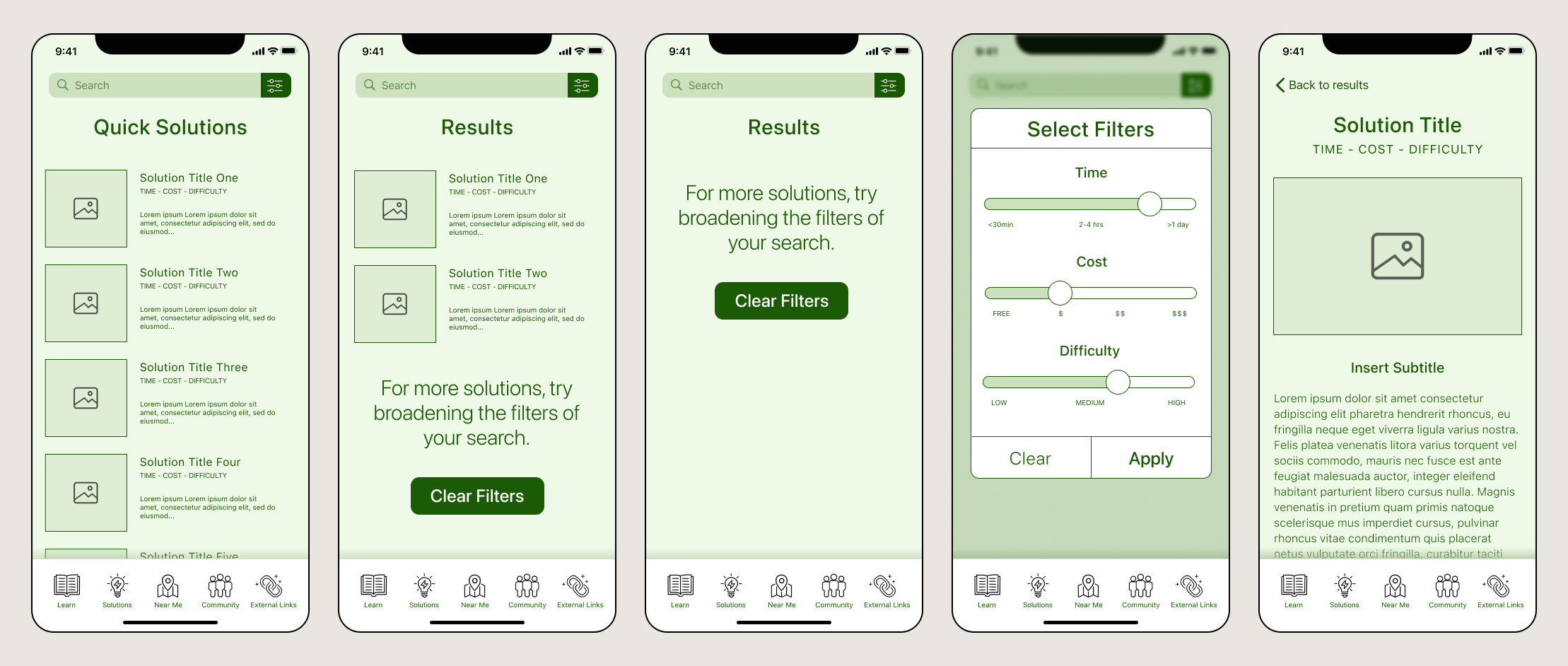
Quick Solutions
HIGH-FIDELITY SCREENS
CREATION & REVISION PROCESS
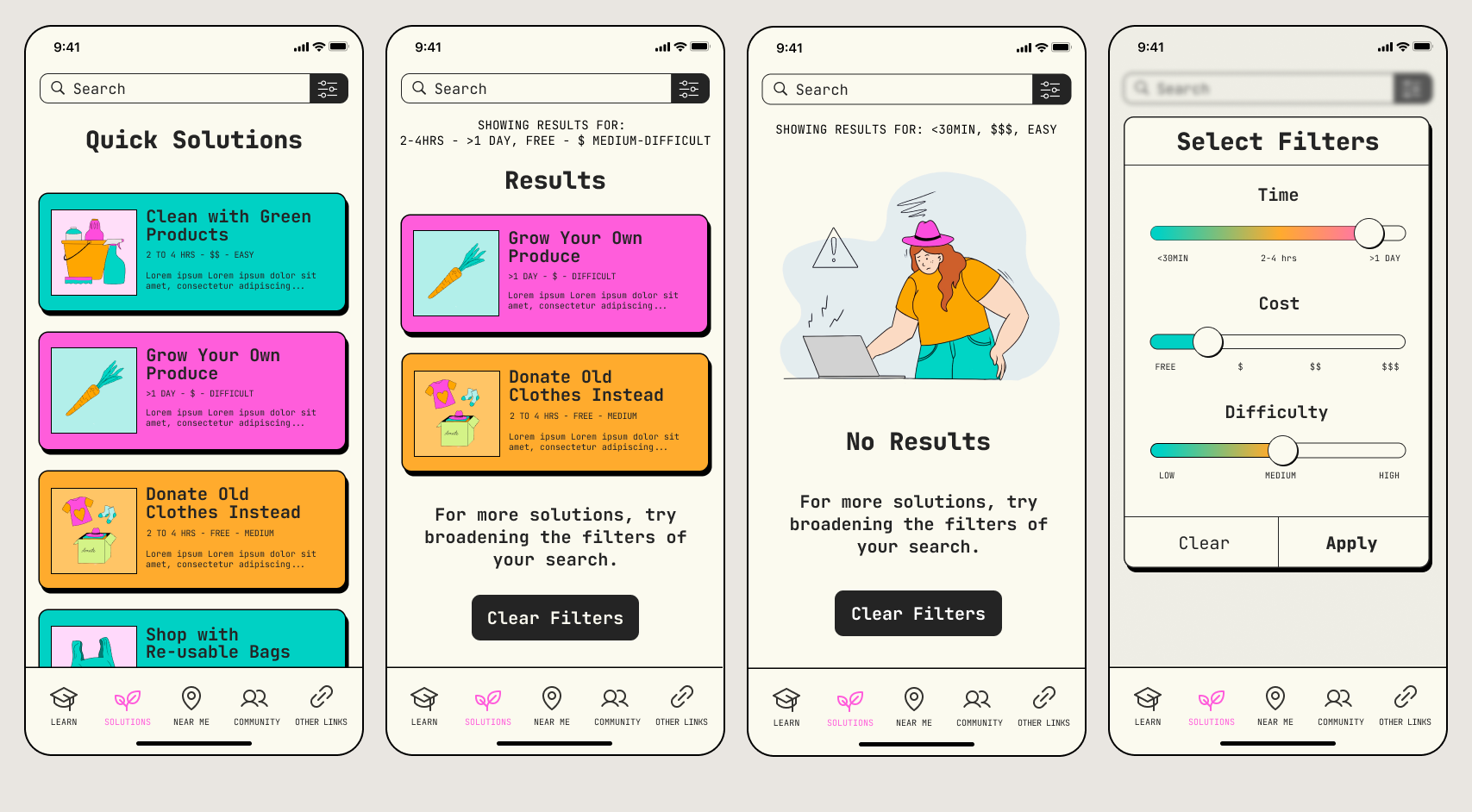
During the creation of my high-fidelity screens, the design for GreenWise underwent a massive shift. In the original mockups and style guide, I had chosen a monochromatic color palette with a generally clean aesthetic. While I was pleased with it at the time, through a round of critique there were outside insights revealed to me about how a user may perceive it for the first time.
The previously mentioned critiques provided valuable insights into the areas of improvement for the visual interest. The limited variety in the color palette and inefficient use of gradients contributed to a visually boring presentation, which may have impacted the user experience if left unresolved. However, the introduction of solid shadows in the final screens brought a playful and game-like element to the design, enhancing its appeal and potentially increasing user interest.
It is noteworthy that my original layout of elements was deemed well-structured and required minimal adjustments, indicating a strong foundation in the initial design. By addressing the color palette and gradient issues while maintaining the effective layout, the project had the potential to evolve into an engaging and visually captivating experience for users.

During the revision process, I revisited the original color palette and introduced a triadic set of hues instead to offer more visual interest for users. This improved contrast between elements, preventing it from feeling nearly as ‘muddied’ as it did in the original designs. In addition, I built off of the playful style of the blocked-in shadows that could be seen in the originals to further push that aesthetic across the entirety of the application, instead.
As a final touch, I added hand-drawn graphics to applicable pages that featured a single character users could become familiarized with along their journey. This resulted in a design that fostered a fun and inviting experience for users that keeps their interest within the information they are obtaining.
USABILITY TESTING & PROTOTYPING
In order to ensure that users get the most out of their experience using GreenWise, I observed five users as they completed a series of four tasks. Through this observation I gained insight on their ability to digest new information, navigate between tabs, find resources, and more. The main goals for the round(s) of usability testing were to:
Ensure that first time users can navigate within the app effectively
To make any accessibility issues in the interface / red routes known
Assess the overall ease of learning when users are consuming educational content under the “Learn” tab
For the specific needs of the usability testing, I performed most of my moderated testing in-person. Due to the primary function of GreenWise being to educate users, I felt that it was valuable to perform moderated, in-person testing to gather extra data points during their learning experience(s) such as body language and facial expression. Given that the target audience for GreenWise is primarily focused on Gen Z and Millennials, I recruited users from both generations for equal representation during testing. More specifically, I recruited users within these groups that ranged from having: a) little to no experience in sustainability, to b) medium to high levels of experience with established habits/efforts in sustainability. This allowed me to gain insight on whether the way information is organized and presented in this app makes sense to both of my stated personas: ‘beginners’ and ‘experts’.
The first, and most prominent, issue within the design was the frustration that users experienced when trying to navigate on the map to find the page of the Truckee Community Garden. The lack of an intuitive, pinch-to-zoom control in the Figma prototype sparked this challenge, leading to visible signs of frustration among users during both rounds of testing.
Secondly, users struggled to efficiently complete the task of finding a quick and free solution that takes less than one day to perform. Despite the availability of filters at the top of the screen on the solutions page, all five users in the testing round either individually read through the solutions or scrolled and skimmed through them, indicating that the filters were not effectively utilized.
Both of these major findings within usability testing remained consistent through the rounds of usability testing. However, when considering the functionality of the app as a whole, in conjunction with users all being able to complete the requested tasks within the testing, these findings were not ‘ground-shaking’.
FINAL OUTCOMES & LESSONS
The research undertaken for the development of a sustainability application that educates users on sustainability, offers real-time solutions, and connects them to local resources resulted in the creation of GreenWise. User flows were carefully designed to optimize the learning pathways for both the beginners and experts within the target audience, providing a structured pathway for users to explore educational content and track their progress. Through thorough usability testing and iterative design revisions, GreenWise evolved into an engaging and visually captivating experience, effectively empowering users to lead a more sustainable lifestyle on their own terms, at their own pace.
Upon reflection, I would have perhaps spent more time making sure that I was pleased with the aesthetics of my design before moving forward. It would have saved me quite a bit of effort if I had not had to completely redesign my high-fidelity screens; while it ended up working out in this scenario, it could potentially become a recipe for disaster in future projects.
Let’s Connect!
For all design inquiries and/or work opportunities, please reach out via this form, or directly by email.
alsmithart1@gmail.com