

INTRODUCTION
The primary issues regarding the Summit Cycles mobile site are centered around user engagement and conversion. The first issue highlighted is a 50% abandonment rate by users who view an average of 7 item pages without progressing to the cart, with a general hypothesis suggesting that users struggle to be able to discern which bike is best based on their features. The second challenge involves a 70% abandonment rate at the customer account registration page for users who place items in their cart.
These issues within the site led me to work towards creating an effective solution for comparing items against one another to allow users to better understand their features, as well as designing a guest checkout option to streamline the purchase process for consumers.
DESIGN ROLES & RESPONSIBILITIES
Throughout the process of developing a solution for Summit Cycles, I was solely responsible for ensuring both its completion and correctness. My responsibilities during this process included, but were not limited to:
Conducting initial research
Synthesizing information to create Jobs-to-be-done (JTBD) Statements
Utilizing these insights to construct wireframes
Building high-fidelity mockups
Multiple rounds of prototype testing
Two rounds of usability testing
The culmination of these procedures gave me an end result to be iterated and revised. These revisions were done on my own with the knowledge gained from testing to deliver a final, fluid solution.
RESEARCH METHODOLOGIES
CONDUCTING SECONDARY RESEARCH TO GAIN INSIGHT ON CART ABANDONMENT & SALES CONVERSIONS
The research phase in this project primarily consisted of online, secondary research to gain a comprehensive understanding of the consumer and website-related factors in cart abandonment and/or lack of sales conversions.
Website-related factors account for most of the instances of cart abandonment, ranging from: lengthy checkout processes, security and/or privacy concerns, insufficient payment options, lack of guest checkout, and general technical glitches.
RESEARCH SYNTHESIS
USING JOBS-TO-BE-DONE STATEMENTS TO HELP DEFINE CONSUMER MOTIVATIONS
Given the purpose that the Summit Cycles mobile website serves, I felt that it was appropriate to synthesize the research done on the problem(s) through the Jobs-to-be-done (JTBD) method. These statements clarify the underlying goals and motivations that drive consumers to use varying products, which is an essential synthesis method for a website that sells products that are meant to perform. Below are JTBD statements I created:
Improve riding versatility with a bike that can perform well on both long climbs and long descents.
JOB PERFORMER (WHO): Enduro Mountain Biker
JOBS (WHAT)
Main Job: Ride both long climbs and long descents
Related Jobs: Race events that include long climbs to long descents
Emotional Jobs: Feel confident that they can do it all
Social Jobs: Being capable of riding bikes with social groups of all discipline(s)
NEEDS (WHY): Improve rider versatility with a bike that must perform well on both long climbs and long descents.
CIRCUMSTANCES (WHEN/WHERE): Whenever the user chooses to ride
Improve the efficiency of climbing on a bike in steeper, sustained cross country terrain.
JOB PERFORMER (WHO): Cross Country (XC) mountain biker
JOBS (WHAT):
Main Job: Perform long, uphill rides with efficiency
Related Jobs: Race XC events
Emotional Jobs: Feel like their bike is not holding them back while ascending
Social Jobs: Being capable of riding bikes with social groups of this discipline and/or enter races
NEEDS (WHY): Improve a rider’s uphill performance with a bike that is lightweight and designed effectively for XC discipline rides.
CIRCUMSTANCES (WHEN/WHERE): Whenever the user choose to ride
Minimize the instability with a bike that will perform well in rough, downhill terrain.
JOB PERFORMER (WHO): Downhill mountain biker
JOBS (WHAT):
Main Job: Ride longer, technical descents with speed
Related Jobs: Race downhill bike events
Emotional Jobs: Feel confident that their bike can take them through the biggest downhill terrain
Social Jobs: Being capable of riding bikes with social groups of this discipline
NEEDS (WHY): Improve rider confidence during downhills with a bike that can handle the most challenging terrain
CIRCUMSTANCES (WHEN/WHERE): Whenever the user chooses to ride
USER FLOWS
CREATING USER FLOWS FOR THE OPTIMIZATION OF THE MOBILE ONLINE SHOPPING EXPERIENCE
Creating user flows for the optimization of the mobile shopping experience was essential for providing consumers with a website that offers a streamlined checkout process, as well as an effective method of simplifying product information to allow for easier decision-making. Additionally, these user flows were designed to help to eliminate potential interactions where users might experience moments of irritation with the mobile shopping platform.
Below are views of my chosen user flows:
Product Comparison
User Checkout


WIREFRAMING
OUTLINING INTERACTIONS ON THE MOBILE WEBSITE
From my chosen user flows, I started by sketching out a series of screens for potential wireframe concepts. These initial sketches were put through a round of usability testing to ensure that my rough outline for usage of the Summit Cycles mobile site was as intuitive as possible for users. Below are the two user flow wireframes that I created:


USABILITY TESTING
FIRST ROUND RESULTS
During the first round of in-person, moderated usability testing, I asked five users to complete the following tasks:
Navigate to the “Enduro” bike product section, and use the comparison tool to review the “Yeti SB160” and “Pivot Firebird”
Take a look at this comparison chart between the bikes, and name at least three differences between the two.
Add one of these bikes to your cart and continue through the checkout process as a guest. Use the credit/debit method of payment at checkout.
The results that were yielded from the initial round of testing were largely aesthetic-related, but also included minor usability issues. These findings ranged from: users having difficulty reading small fonts, to some users pointing out the lack of indication of knowing which bikes they had selected for comparison.
HIGH FIDELITY SCREENS
THE PROCESS OF CREATING AND REVISING MY DESIGNS
After certain usability revisions became apparent in testing, I moved on to rendering my sketches into the first versions of high-fidelity screens. These renders included the basic structure originally found in my first sketches, with slight alterations in structure.
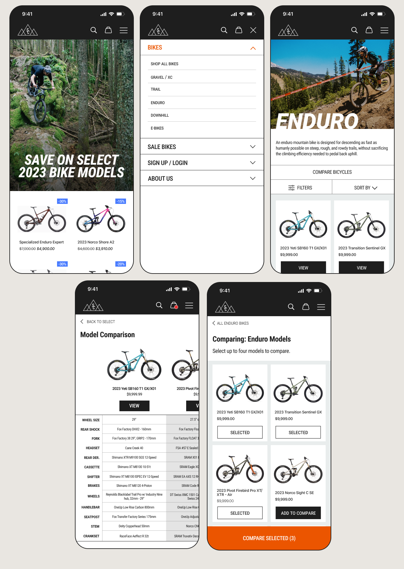
COMPARISON FLOW
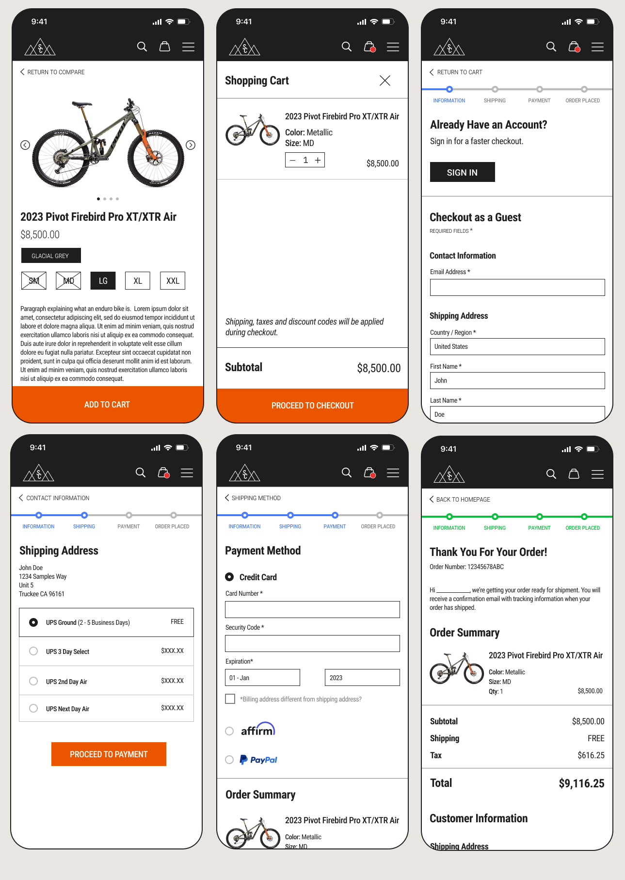
GUEST CHECKOUT FLOW
USABILITY TESTING
SECOND ROUND RESULTS
During my second round of usability testing, I asked users to complete a slightly modified set of flows in comparison to the first round. The second set of requests were as following:
Navigate from the homepage to the “Enduro” bike product section, and to tap on the “compare bicycles” button.
Select the following four bikes to compare. Once you have selected these bikes, hit the “compare selected” button.
2023 Yeti SB160 T1 GX/X01
2023 Transition Sentinel GX
2023 Pivot Firebird Pro XT/XTR Air
Specialized Enduro Expert
From the comparison chart, I’m going to ask you to name at least three differences between any of the four bikes.
From the comparison chart I will have you add the “Pivot Firebird” to the cart and complete the checkout process with this bike.
While there were not any noted hindrances for users performing the requested flows during the second round of testing, it became apparent to me that my checkout flow lacked one screen in particular.
HIGH FIDELITY SCREENS
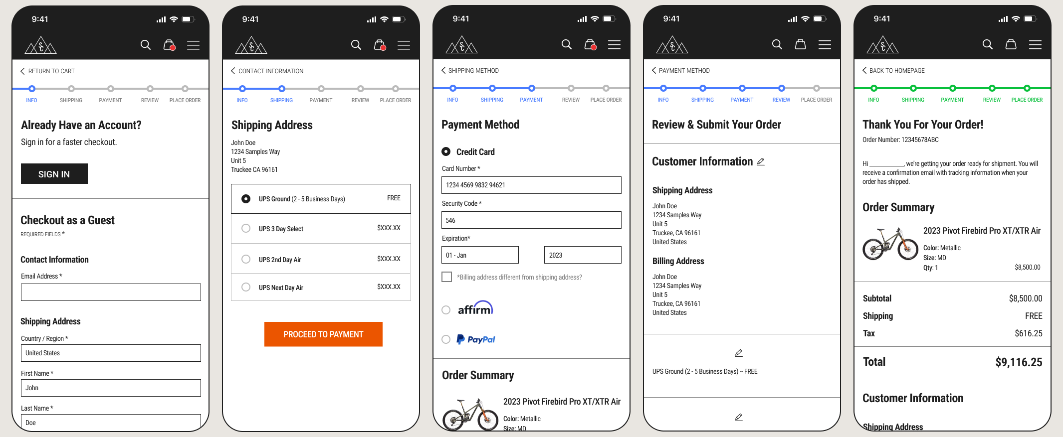
FINAL ITERATIONS
The final addition to this flow was a screen that offered the last confirmation of the following: customer information, shipping choices, payment, and cart quantities before the user submits their order. The addition of this screen gives customers a final opportunity to make edits to any of their entered information, ultimately, giving them a stronger sense of control and trust. This also required that I add another step into the progress tracking bar at the top of the screen in the UI.
FINAL CHALLENGES & OUTCOMES
The most technical hurdle during this design process was centered around creating a solution that helped users compare products against one another to aid their decision-making process. For the comparison feature, I wanted to make it possible to view the technical aspects/statistics for each product simultaneously. This came to fruition as a horizontally-scrolling table, seeing as there was far too much information for each product to suit a vertically-scrolling screen. While the decision to create this table came easily, it presented its own challenges in the design aspects. I had not included this level of intricacy in any of my prototypes before this moment, leaving me to learn how to make a clean, functional table that was able to put emphasis on the product at the center of the screen through its own visual weight.
I originally did not know what would be the best method in doing so; my first iteration of the table functioned with it being an image rather than a collection of elements. This resulted in disproportionately sized text in comparison to the rest of the UI, leaving me to revisit the drawing board. Throughout more experimentation, I eventually realized that while it was more complicated to complete, it was better to create each aspect of the table with its own elements (text, chart lines, gradients, etc). In the end, this solution ended up being smooth and effective, allowing participants in the usability testing to successfully complete the tasks I requested of them.
Let’s Connect!
For all design inquiries and/or work opportunities, please reach out via this form, or directly by email.
alsmithart1@gmail.com